AI Travel Planning Interaction Design Template
Kingston University London
Deliverables: Research, Analysis, Process work, Prototypes, Finished design file, Presentation overview
Platform(s): Miro, Figma, Marvel, Adobe CC, ChatGPT, Gemini
My role: UX/UI, interaction and visual designer, user researcher
The problem
As AI integration in the travel industry accelerates, a significant gap exists between the potential of AI-powered travel planning and user trust. While travel companies invest heavily in AI-driven solutions, user needs for personalized and customized travel experiences remain largely unmet. This disconnect between technological capabilities and user expectations poses a challenge to the industry, hindering the full potential of AI to revolutionize travel planning.
Overview and focus
The Travel Planner GAI Template is to be designed for travel planners and bookers to help them create detailed itineraries, explore activities and locations, and book their trips. It aims to be a reliable GAI travel planner that users trust by providing opportunities for customization, personalization, discoverability, and shareability.
Research questions
01
Can everyday travel bookers and planners navigate the GAI travel planner to quickly and easily find the information they are looking for?
02
Do the details and customization of information presented within the travel planners meet users’ expectations and level of satisfaction?
03
Are users of GAI travel planners able to quickly and successfully share the itineraries they plan or add collaborators to the trip plans?
Research and baseline testing
Survey study
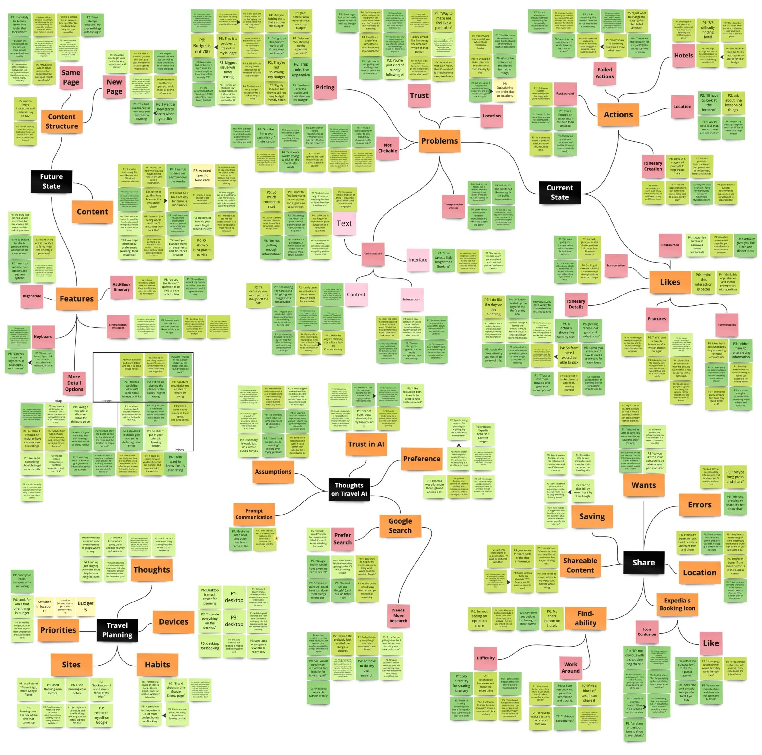
It was discovered that the current satisfaction rating for general interactions with GAI was at 3.5/5, while the overall trust rating was at 3.28/5. Survey participants generally had an above-average experience with GAI, but there were hesitations and limitations when it came to its uses. Transparency, trust, language and communication, and the overall interaction being the top 4 brought up issues and topics for improvement.
Baseline testing takeaways
Problem 1: Users need a way to quickly and easily create itineraries that are customizable.
Problem 2: Users new to GAI systems need a welcoming and reliable interaction to build trust for their travel decisions.
Problem 3: Users need details like maps, images, and experience information to help with their decision making process in travel.
Understanding the users and their needs
Chelsea likes going into her trips with as many things booked and planned as possible. This includes knowing time durations, opening times, and prices of experiences, and/or bookings for transportation in between them. Because Chelsea likes being so detailed about her trips, she has very low trust for the amount of information that GAI will be able to give her. Due to the lack of transparency from most generated responses, Chelsea is unsure where the information that is being recommended to her is coming from, so she feels unsure if she can trust it. Chelsea thinks that GAI for travel could be very useful if it could give her the level of details that she needs for planning, but right now she is disappointed in its capabilities.
Natalie, is an idea finder and wants to gather as much information as she can for what there is to do at the location. Once she has options, she can send out the ideas for the trip to the people that she is travelling with to be able to see which they would prefer doing before booking. Natalie likes the idea of GAI for travel a lot because it can be a great starting point for her to find travel ideas, but she would never blindly rely on a generated itinerary. If the people she is travelling with are relying on her for planning, she wants to make sure it goes smoothly. She will definitely use GAI to start her planning, but will use the opinions of her travel companions to finalise bookings.
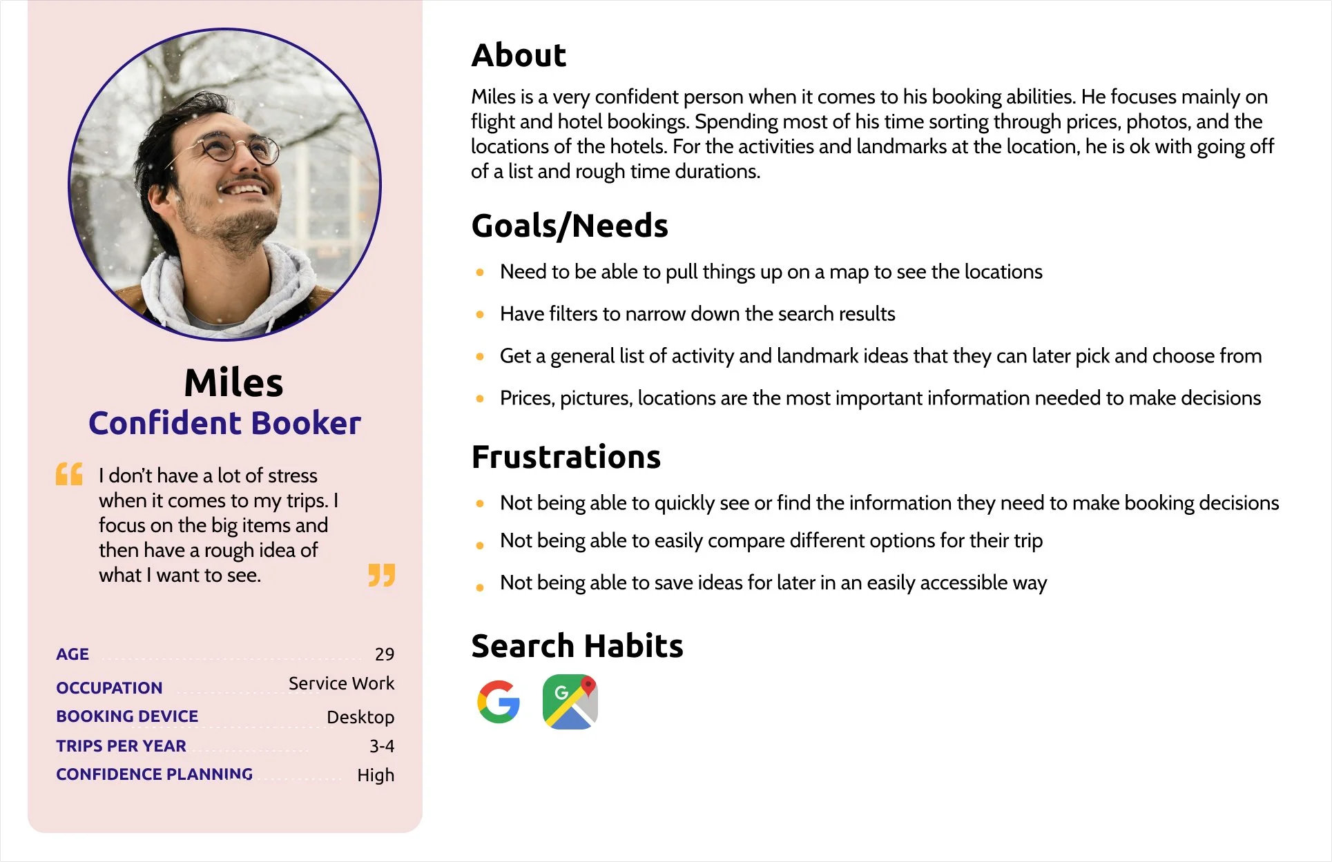
Miles feels very confident in his booking capabilities and takes pride in the fact that he is able to book his hotels and flights very quickly. Most of the time Miles is indifferent to having a full itinerary and just focuses on buying the big ticket items: the hotels and flights. He likes the idea of GAI travel planners because in the future they could potentially help him find the best deals on hotels and flights even quicker than he is able to do now. Unfortunately, Miles believes that GAI in travel is still not developed/accurate enough to be of use to him. In the future this can be mediated by generated information that is more aligned to Mile’s needs, including images, greater customization of generated information, and clickable and comparable hotel information.
The main users of the GAI travel planners were narrowed down to analytical planners, detailed idea finders, and confident bookers. These findings are based on the participant profiles and responses in the survey, planning and booking responses received from the participants in the testing, and from research done into the types of personas currently using the larger travel booking websites.
Ideation and competitive analysis
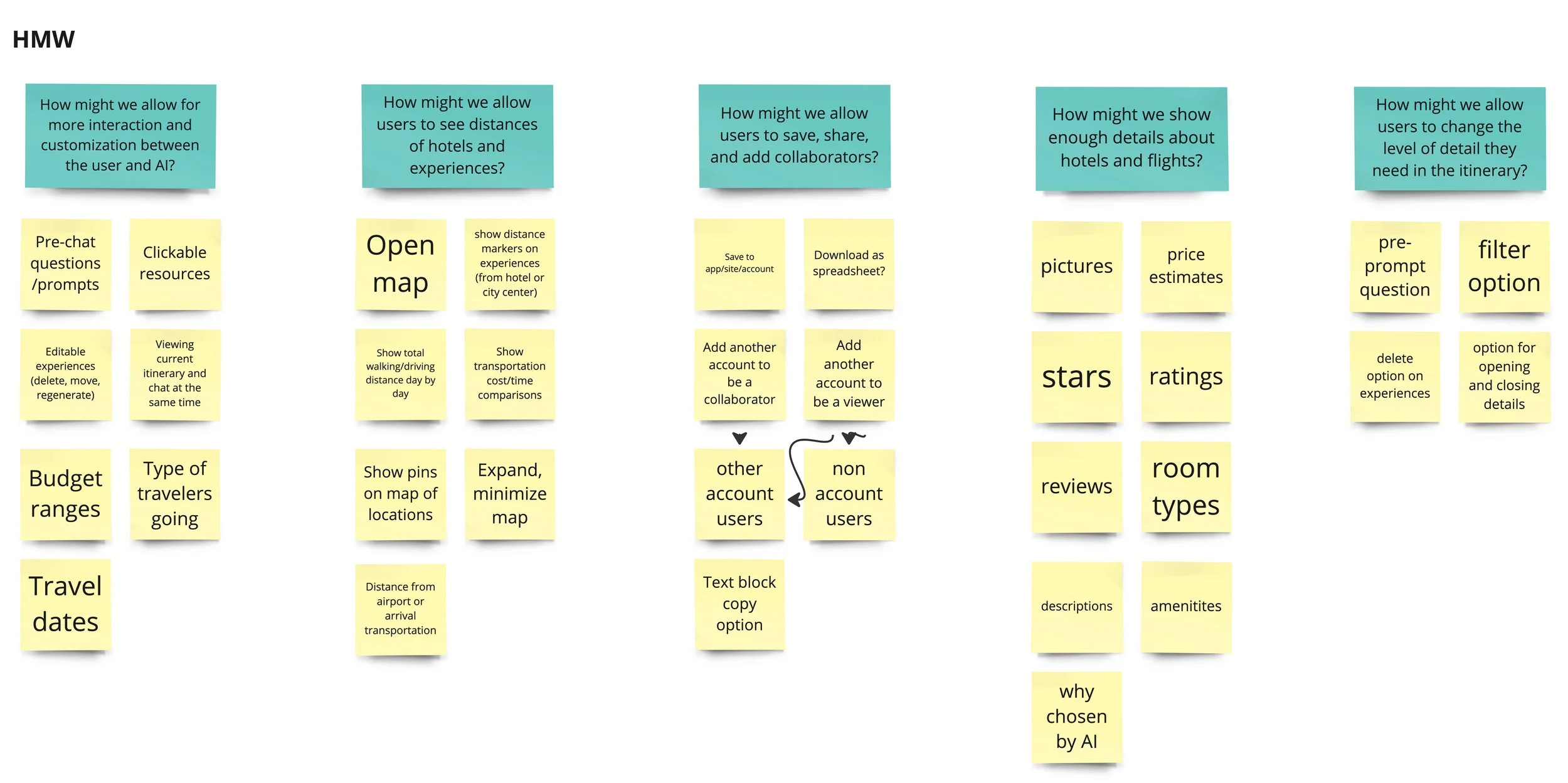
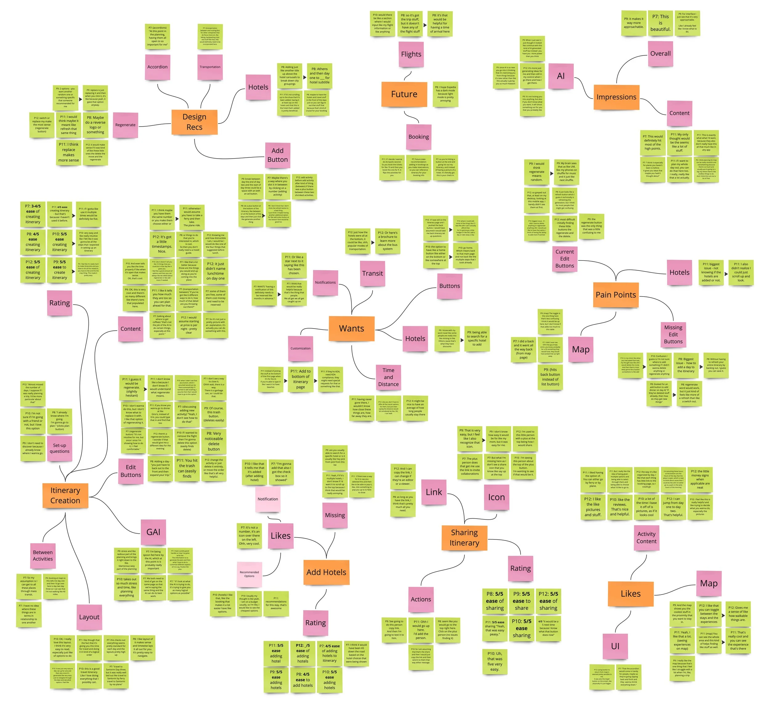
The ideation process was started with How Might We statements to help pinpoint areas within the design that needed further consideration. These How Might We statements were brought into the rapid idea generation, to further ideate how these designs could function. Then, two of the How Might We statements were further brought into Crazy 8s to help begin visualising how the design considerations could look and work in a prototype. Below are the stages and results of the ideation process before the layout ideas and features were further looked into in NUF testing and the low-fidelity prototype.
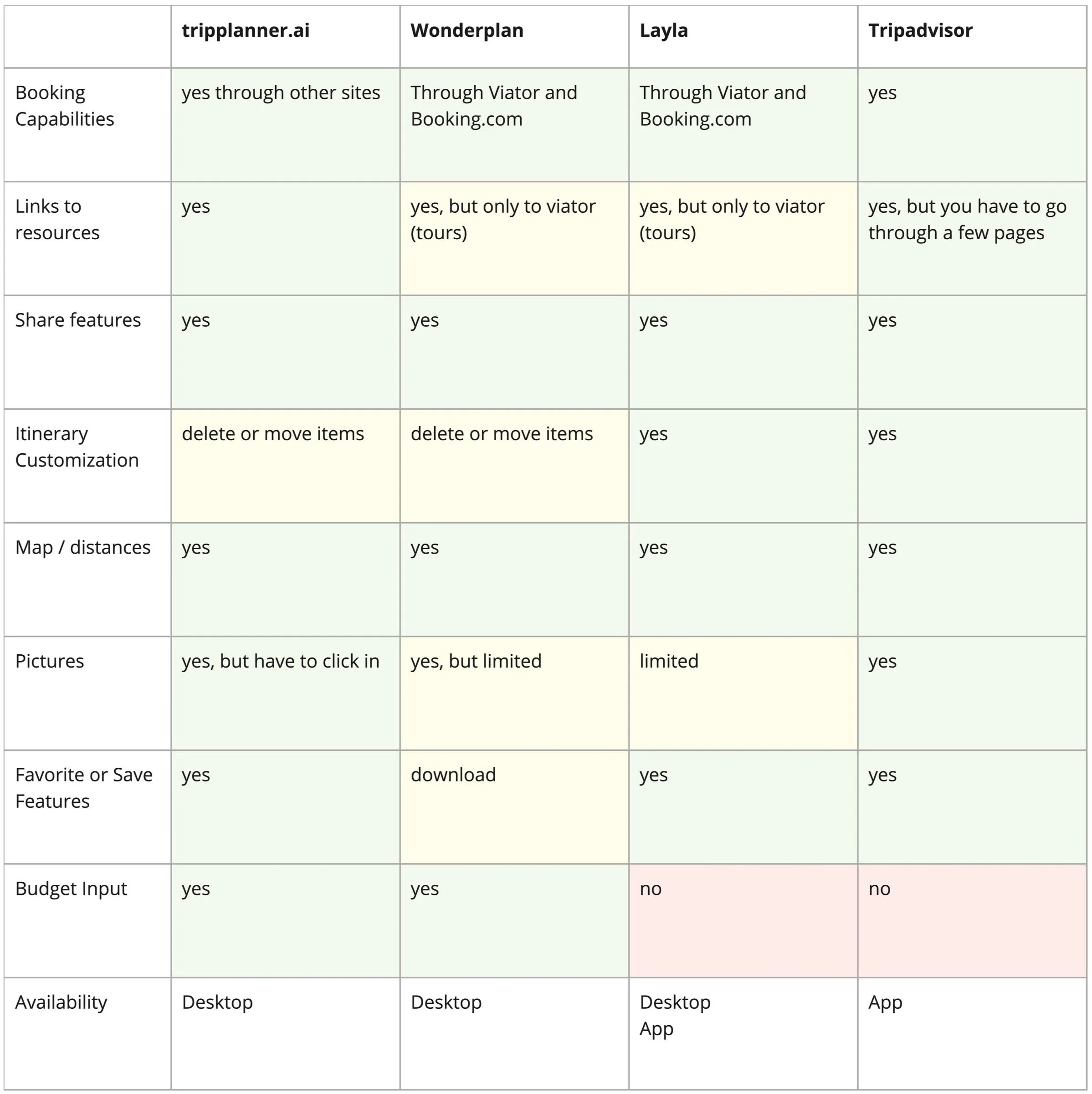
Once the ideation processes were completed, a quick look at competitive GAI travel planners, outside of the big travel booking companies, were looked at. The purpose was to understand which features they included and how they currently functioned in comparison to the Beta GAI travel planners.
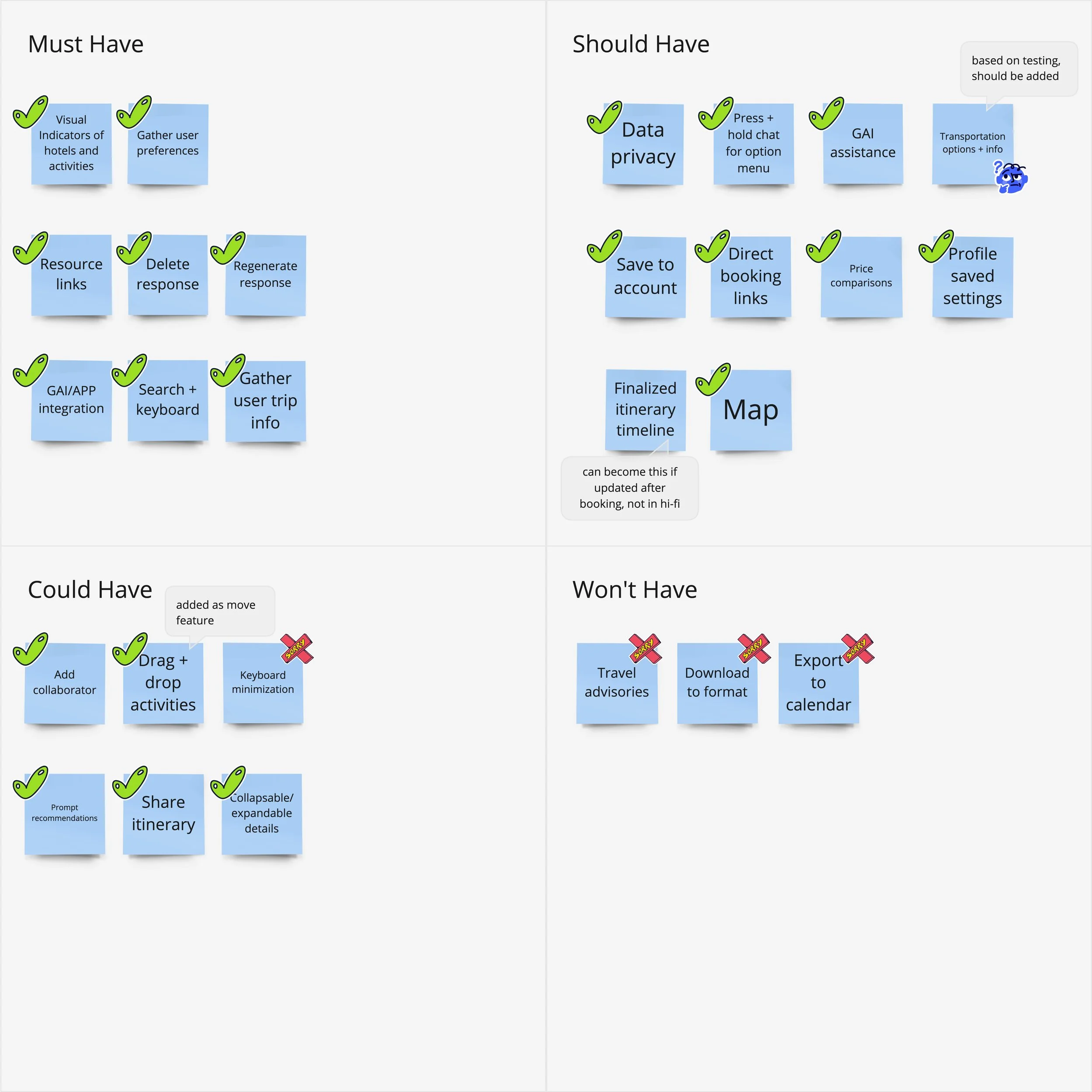
Before moving into wireframes and prototypes, the features outlined in the ideation and competitive analysis were prioritized. The purpose for the prioritization was to ensure the features being included in the design template aligned with the needs of the users, the problems the design was working to solve, and limited the scope of the project for the alotted time.
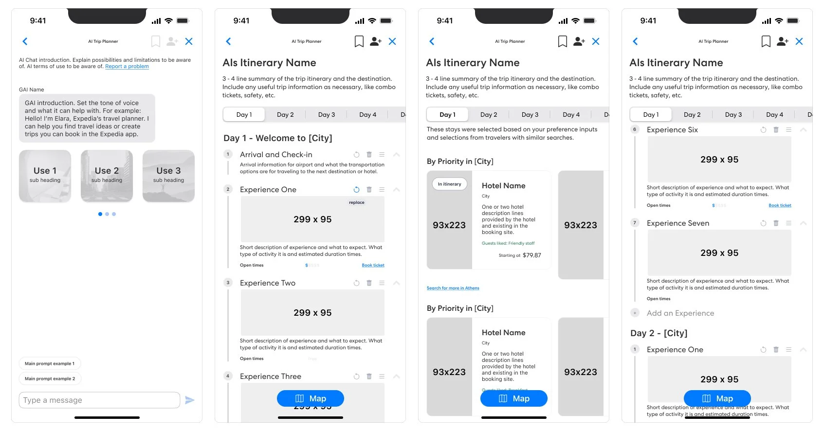
Low-fi mockup
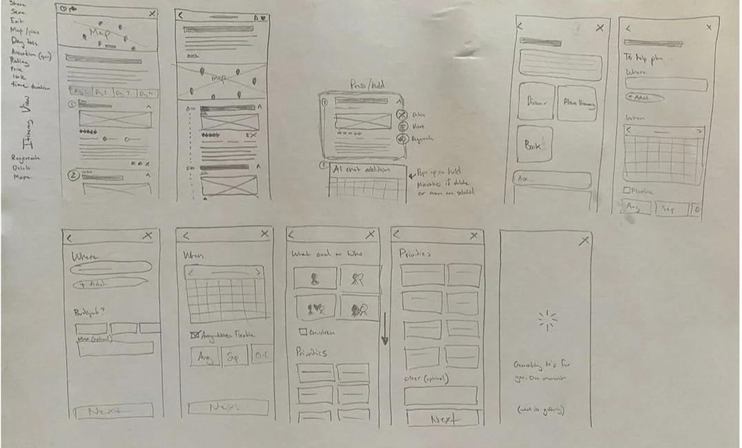
The low-fidelity prototypes were used to make quick sketches of the layouts, pages, components, and interactions of the features that were prioritised in the NUF test. During the low-fidelity prototyping, button interactions were also further explored. For example, various versions of pop-ups for sharing the itinerary and adding a hotel were quickly explored and were decided on during the low-fidelity stage. The determining factors were based on the visibility of the options, the amount of clicks it would require to proceed, and the clearest way to display the options to proceed.
Mid-fi mockup
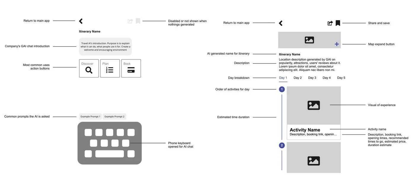
Based on the sketches in the low-fidelity prototype, these interactions and components were further explored in the mid-fidelity mock-ups. The purpose of the mock-ups was to begin to visualise what and where text would fit in with the other components and how users would progress through the flows through interaction and conversation.
Hi-fi prototype and test takeaways
After each task was completed, short conversations were held to follow up on any areas where hesitation or questions came up. During these conversations, participants were more likely to provide feedback for the interactions they had just experienced. These takeaways support the findings from the usability tables and also highlight further design recommendations from the participants.
Below are the design recommendations that were taken into consideration for the final template design:
The “Regenerate” button needed to be renamed “Replace” to better match the users’ understanding of what the button action would be.
The back button from the map needed to return to the itinerary, as a few participants tried to use it to return to their itinerary. This interaction change would mean that from the itinerary page, the user would return to the AI conversation with the itinerary questions loaded.
Based on the feedback given about the back button, another suggestion was given to add a home button that would return the user to the app’s home page. This way the user would know how to fully exit the AI interaction, instead of having to click the back button a certain amount of times.
The need for an add activity/experience button arose during the first task when a couple of the participants noted that they would have deleted an activity and created a new one to regenerate the content. Discussions on the placement of the button, between each experience or at the bottom of the day, ended up influencing the final template design.
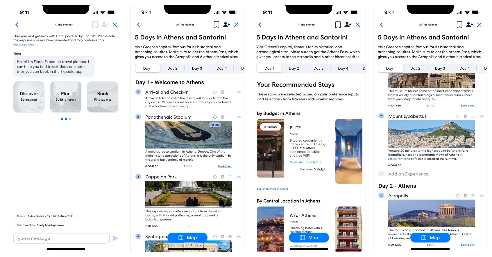
Final design
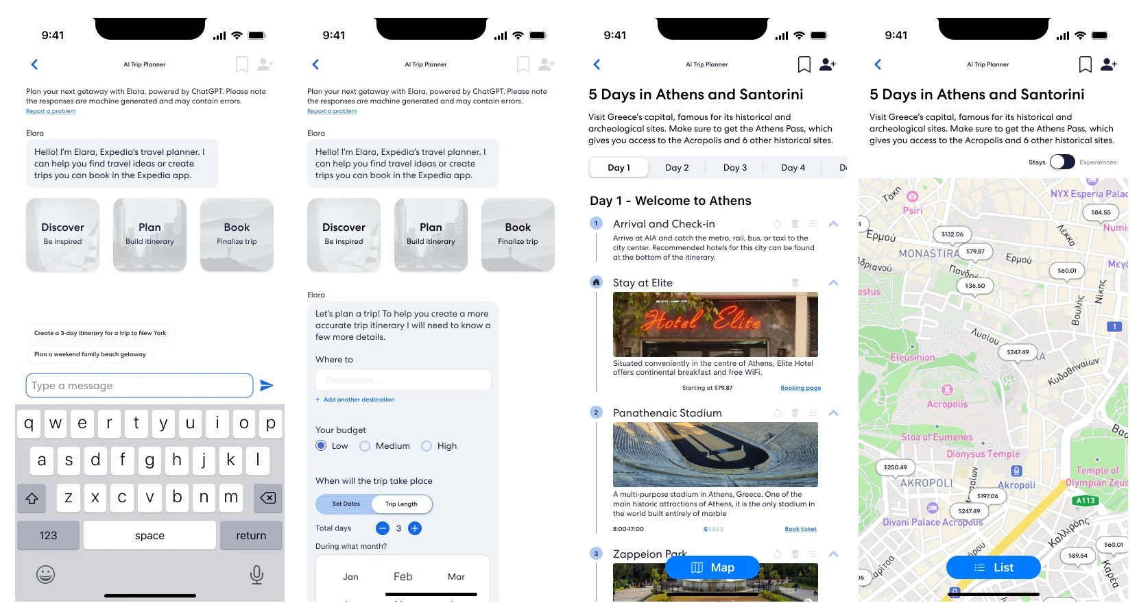
For the final design, the design recommendations mentioned and observed in the comparative usability test were updated into the original template design file. These changes are listed below:
The regenerate button was renamed to replace
A darker colour contrast was used for for the edit buttons to make them more noticeable and align with accessibility standards
The back button was relinked to go back one page, instead of out of the entire GAI flow
A return home interaction was added to the GAI workspace to allow users to easily exit the GAI flow
An add button was included to the bottom of each day’s itinerary list
Notification pills were added for hotel cards that were included in the itinerary

