Offer Page Redesign
Costco Travel
Deliverables: Research and Analysis, Design Recommendations, Prototypes, Finished Design File, Stakeholder presentation
Platform(s): Figma, Usertesting.com
My role: UX Designer, Collaborated with the user researcher
Project Strategy
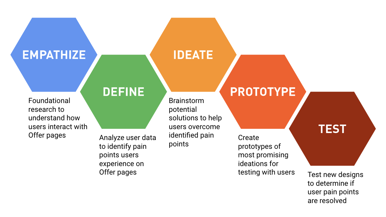
Research and Design Method
Stakeholder Goals
Increase noticeability of the “Check Prices & Availability” button
Pages are currently too text-heavy and need more visuals
Figure out how we can make the available travel dates clearer
Research Goals
Determine what users need and expect from an offer page
Understand how members interact with Costco Travel offer pages
Identify member pain points
Research Questions
What are members’ expectations for engaging with offer pages?
How do members behave on our offer pages?
How do members consume information on our offer pages?
What pain points do members experience on offer pages?
Original Offer Page Design
Moderated usability tests were conducted on the current designs of the offer page as foundational research. The purpose of the testing was to establish whether the outlined stakeholder goals aligned with users’ needs and expectations for these pages. Below are the 3 most important user problems that were discovered in the tests:
Foundational Research
Users lack initial engagement when they land on an offer page because they do not find the information that they expect to see or need in order to hold their interest in exploring the page further. Adding users’ top priorities, in a quick and digestible way, to the top of the page will capture users’ attention and will result in more users exploring the offer page further.
"(Prefers) lots of images of something that is attractive, nice imagery, good reviews.” - Participant 5
Problem 1
Users miss vital information that will influence their decision to proceed with the offer because that information is either hidden, in a large block of text, and/or unavailable on the page. By making information that users prioritize and expect to see clearer and more available, users will be able to find the information they need more easily and quickly to proceed with the offer.
“(Learn More) is so subtle and if that's where I need to find rooms, that’s badly designed. Something as important as room type shouldn't be here. This is such a waste of space.” - Participant 4
Problem 2
The process for members to know the price and availability of a vacation package on an offer page involves increased screen navigation and many clicks on our website. Members become frustrated when package prices are not listed up front in the offer workflow because they want to know which offers fit their budget right away. By improving how we display prices, we can make it quicker and easier to meet our users' needs.
"Everything feels like a secret here. That annoys me. Where are the prices? There is too much clicking, too much scavenger hunting.” - Participant 3
Problem 3
Ideation & Design
Going into the sketching process, it was important to keep the stakeholder goals and user problems in mind. Along with these, a few additional pain points had been noted in the testing that needed to be resolved in the designs:
The price and availability needed to be above the fold to align with users’ needs and expectations of this information.
The room information needed to be more easily available and higher on the page to align with users’ expected information hierarchy.
Access to a map needed to be available sooner.
Transportation information needed to be included as users greatly valued the ease of travel to the destination in their decision-making processes.
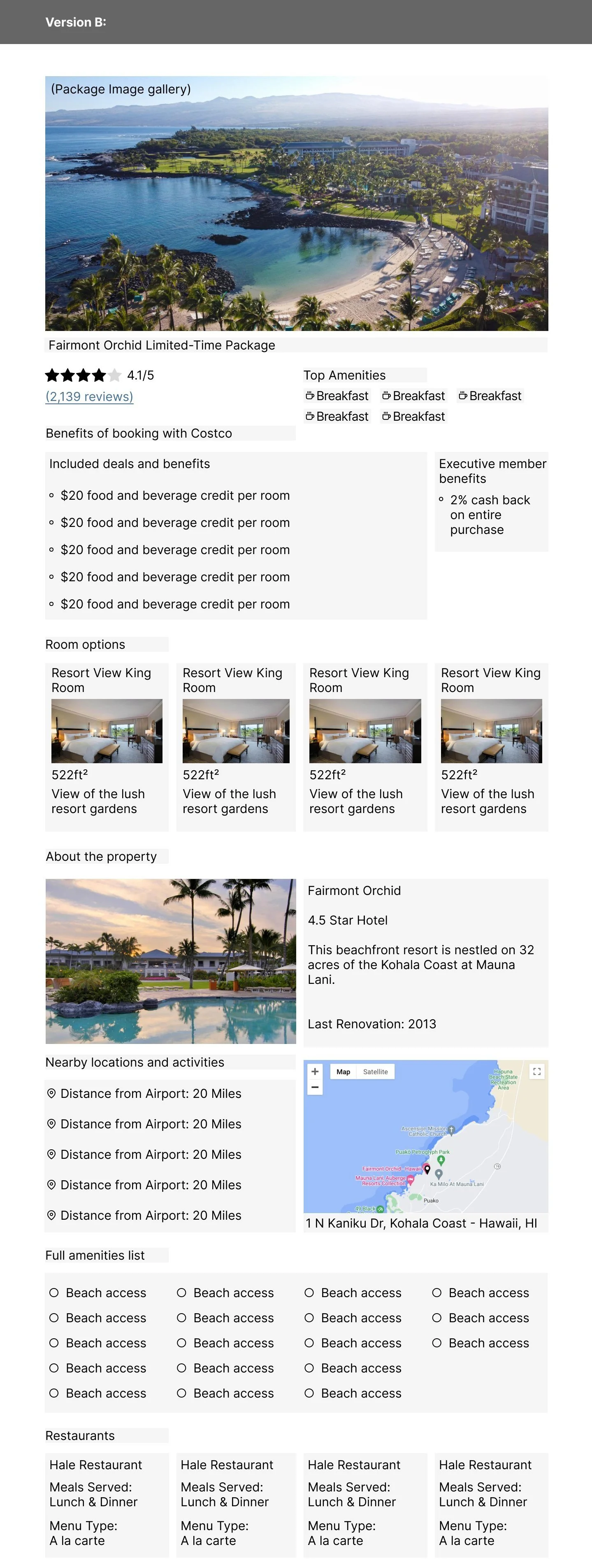
Low-fi sketches and mid-fi mockups were presented to the design team for feedback, which resulted in two variations of information hierarchy. These were tested in an unmoderated A/B test for quicker results that were then used for the higher fidelity prototype.
Sketches for layout ideations
Mid-fi mock ups for A/B Test
Based on A/B Testing
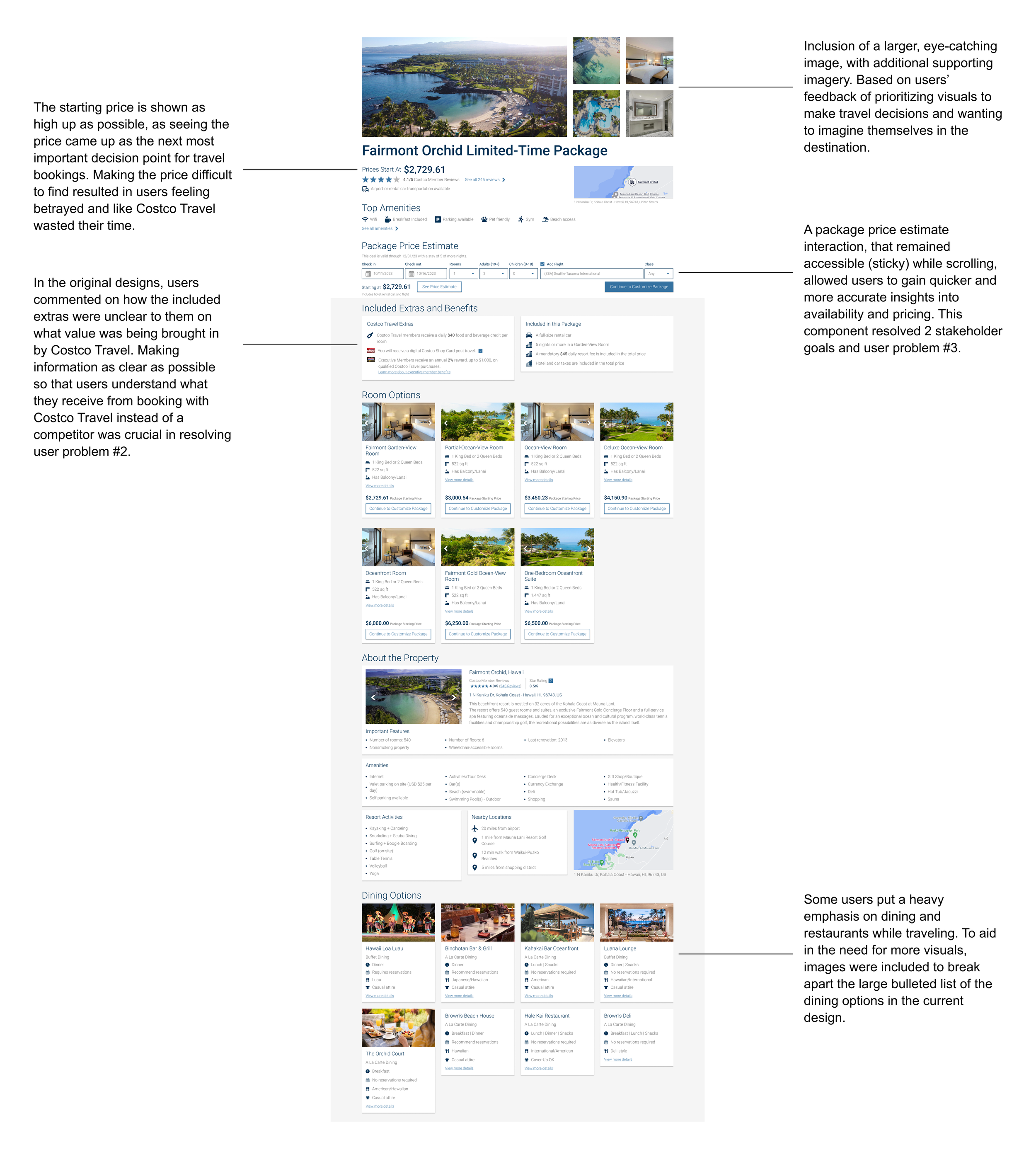
High-Fidelity Prototype
Project Hand off and Conclusion
Due to some time-consuming changes required on the back end to accommodate the design recommendation, stakeholders were hesitant to prioritize the implementation. They acknowledged the design changes were beneficial for the users and company; however, the changes would need to be released in increments.
Design mockups for how the design could be published to the live site in stages were created for developers.
Unfortunately, due to the delay in the project schedule, the project was handed off to another designer when I left the company.


