Youdo! Mobile App
General Assembly
Deliverables: Research, Analysis, Process work, Prototypes, Finished design file for hand off
Platform(s): InVision, Sketch, Miro
My role: UX Designer, UX Researcher
The problem
People trying to organize information in their lives need a better way to consolidate content and streamline interactions between different life organization apps because they want to spend less time maintaining and more time doing.
Beginning with foundational research
In order to get a general sense of problems that users were facing regarding life organization applications, I created a user list based on people that actively used 1+ applications to keep track of information in their lives. The list of participants was determined through a survey that was sent to friends, coworkers, and friends of friends of various age ranges (20-62).
Once I had a pool of 10 participants, I conducted user interviews to get a general sense of how the participants were utilizing these apps on a daily basis. The purpose of the interviews was to determine what the user’s goals were, what drove them to use the applications daily, and the problems (if any) they faced in doing so. Below are the overarching findings from these interviews:
Reduce cognitive load
The purpose of life organization apps is to reduce the user’s cognitive load in their day-to-day lives. By writing information down or tracking dates and reminders, users are eliminating the energy it takes to remember this information. They rely on the applications to track and manage this for them.
Reduce time on apps
Save space on phones
Users that are utilizing life organization apps want to save time in their lives. By organizing and tracking dates in one location, they are able to spend less time searching for this information elsewhere and spend more time on the information, plans, etc that they are keeping track of.
“I want less phone time, but I need more to be more efficient.”
Users are conscious of their phone storage. They do not want multiple apps that have the same functionality, or an app that they do not use taking up space. Users will remove an app if they find a different app doing the same thing and more (interface and functionality depending).
“It should take me less effort to use the app than to memorize all of the things I’m trying to track.”
“I’m conscious about how much app storage is on my phone.”
Understanding the target user and their goals
Sorting user goals, frustrations, and motivations allowed me to gain a new perspective on the needs of the users. Who was I solving this problem for? Why was this a problem for them? In comes Briana, my persona for the Youdo! app.
Existing apps and their functionalities
After learning more and understanding the users, I targeted my research toward competitors and the functionalities that were available on the market. My research focused on 2 areas:
Apps that focused on maintaining various life organization information (what my app would focus on)
Individual apps that users were currently using that were only tracking 1-2 variations of life organization information (like the notes app)
There were only 2 apps that focused on tracking various life organization information: A-List and Any.do
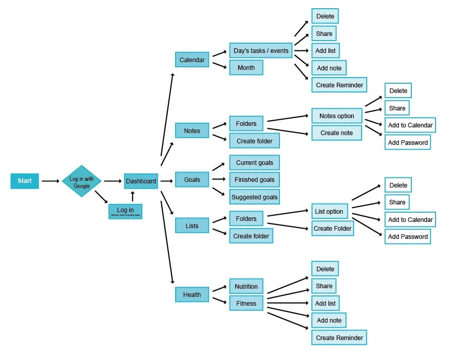
Feature prioritization and flow
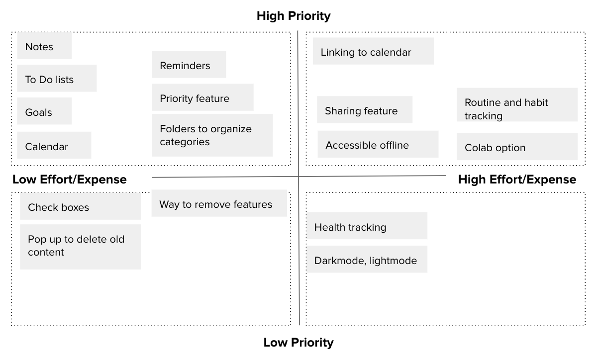
Must have
Notes
To do lists
Goals
Calendar
Reminders
Minimize/maximize content
Should have
Category folders
Sharing feature
Priority feature
Feature removal
Could have
Unused content reminder
Colab option
Option to organize by most used or last created
Routine and habit tracking
Accessible offline
Won’t have
Health tracking
Iteration 1 and usability testing
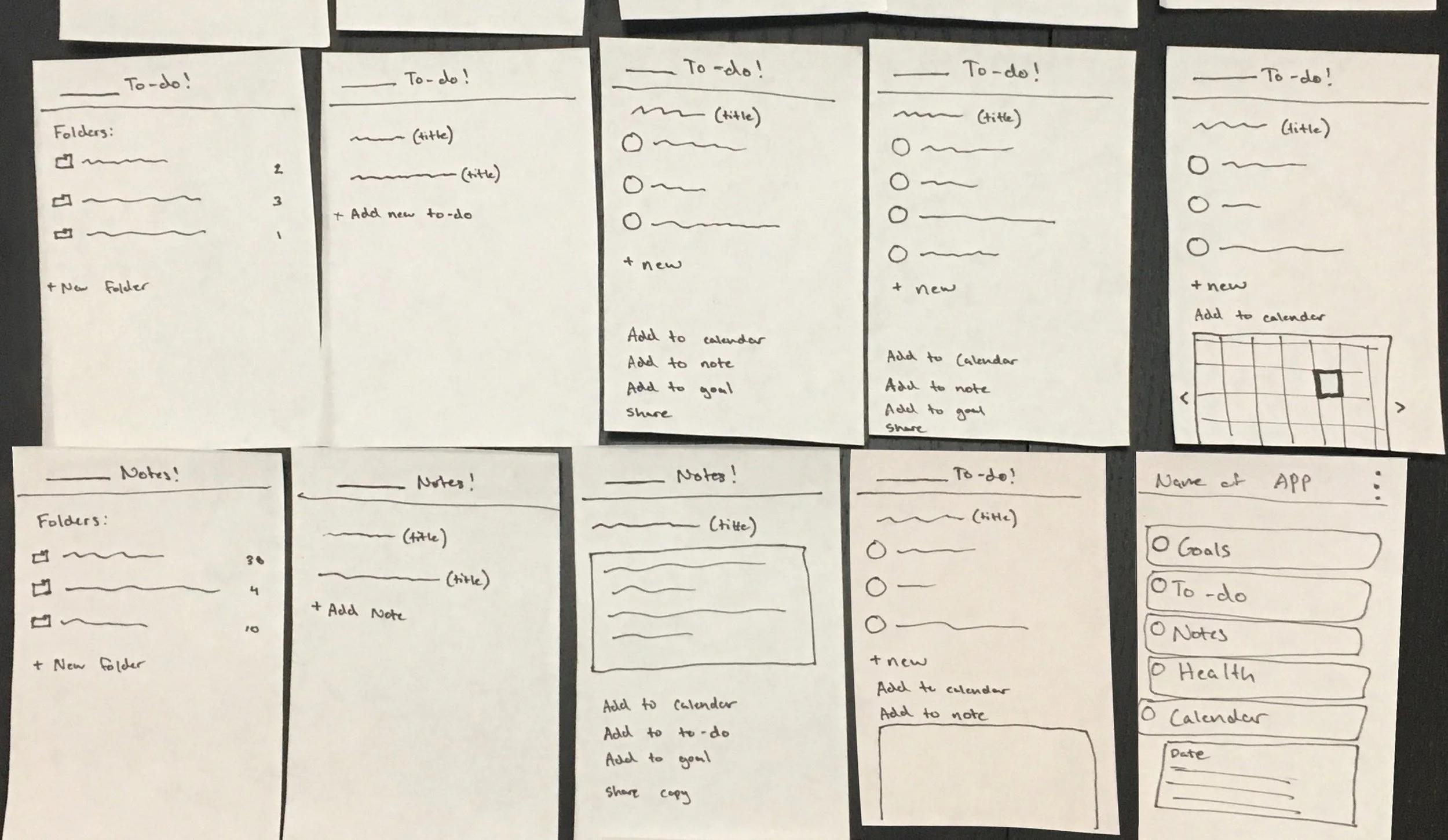
Preliminary sketches of the UI and navigation between the different functionalities in the app based on the user flow created (note the health portion of the app was deprioritized and replaced with reminders).
The flow and usability were tested on the Marvel phone app.
Through user testing, I was able to discover key issues that directly translated into my next iterations:
Making categories and headings more distinguishable. Users needed reminders of what page they were on and what information they were editing.
One of the main goals of our persona was to save time and get to the information quickly. This was reiterated in the testing with users mentioning sections needed to be minimizable.
Iteration 2 and usability testing
Iteration 3
Direct user feedback on my low-fidelity designs influenced the directions I took for the designs moving forward. More feedback I received was:
Ability to rearrange list items
Making typable options more clear
Semi-final design
+ visual design
After going through 3 usability tests and being content with the user experience and interaction of the app, I was ready to do a last take on the visual design of the app.
There was confusion on why the Goals and Reminders sections were the same color, but all other categories had a distinct color.
Youdo! is an app tailored for you and about you. Their settings was moved to an overall account/profile icon in the top right corner.
The purpose of the app was to bring together each of these distinct features to work together in one location. The colors for the icons were removed as the colors were not utilized in later parts of the workflow.
I refined the search bar at the bottom of the page to match the color scheme and style of the app.
The alignment of checkboxes and headers was fixed in later pages of the workflow to help distinguish categories and line items.


